Revitalizing Art Discovery:
The Variable West Website Redesign
The Variable West Website Redesign
Download
Phase I:[ view full report ]
Phase II:
[ view full report ]
Phase III:
[ view full report ]
Phase IV:
[ view full report ]
Phase V:
[ view full report ]
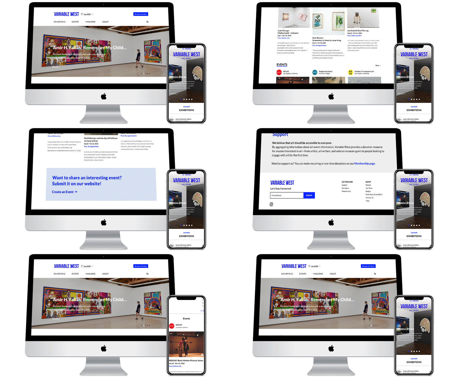
Variable West pioneers as the inaugural platform offering a comprehensive calendar of art events spanning the West Coast of the United States. Our mission is to boost involvement within the West Coast art sphere, fostering growth in local communities and fostering global dialogues. The objective of this website redesign was to enhance the information architecture, ensuring an improved site navigation experience, sustaining visitor engagement, and elevating the visual design aesthetics.
Methodology
Usability Test
Timeline
Usability Test
Card Sort
Data Analytics
Wireframe and User Flow
Prototype Design
Timeline14 Weeks
Team Members
Christina Tenny
Type
Desktop
Christina Tenny
Jamie Chen
Aimee Shi
TypeDesktop
Mobile
Phase 1
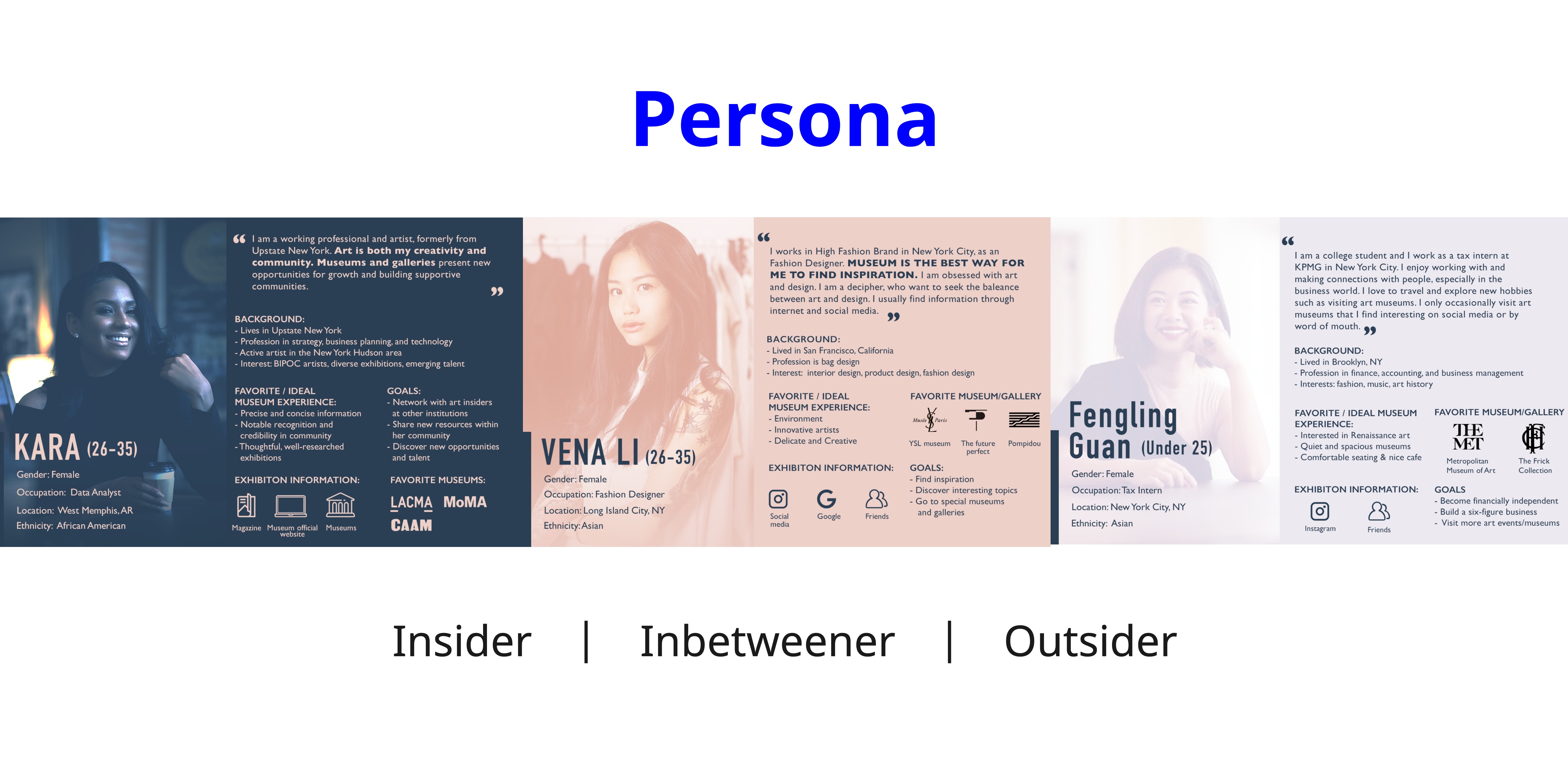
Create Personas
Phase 2
Create Sitemap
Create Sitemap
& Wireframe
Phase 3
Complete
Complete
Competitive Analysis
Phase 4
Paper
Prototypes
Paper
Prototypes
+ High-Fedelity
Wireframes
Phase 5
Final Design
Final Design
Desktop & Mobile
PHASE 1
Understanding
Target Users
Understanding
Target Users
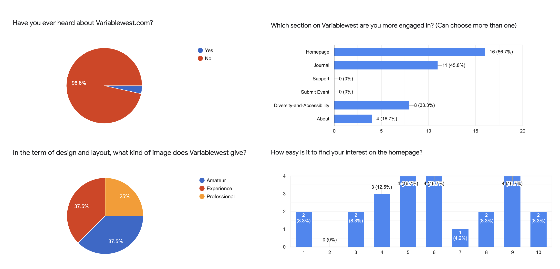
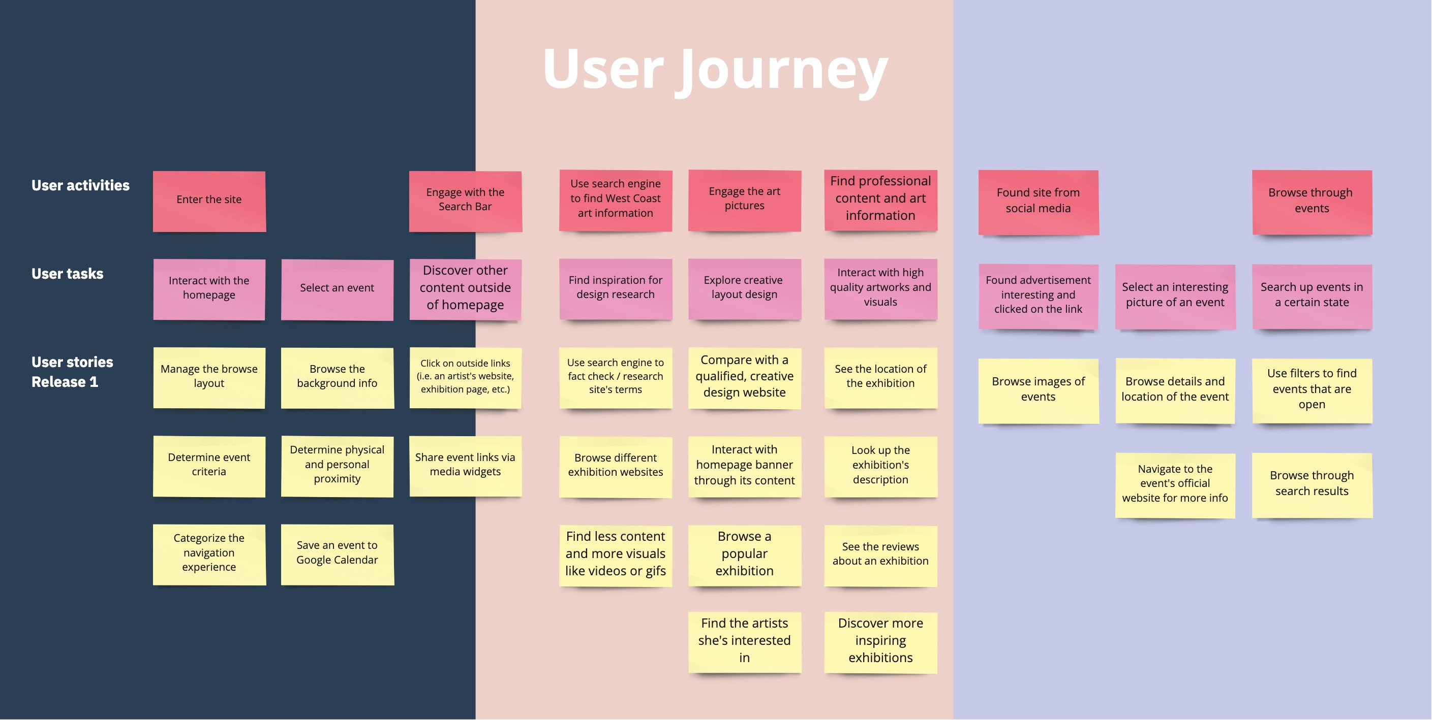
Our objective was to gather a comprehensive range of user interactions and feedback regarding this website. Our aim was to amass substantial data, identifying consistent areas for improvement and significant pain points, both in general and specific to individual users. To achieve this goal, we employed a diverse array of research methods, incorporating them before, during, and after conducting user interviews and surveys.
Key Findings:
- Having a strong homepage design attracts users to explore more of the website’s contents
- VariableWest's image was more Experienced/Professional but found many flaws and had difficulty navigating around the website
PHASE 2
Structure Information Analysic
Structure Information Analysic
We gathered data from participants through card sorting and tree testing exercises. Notably, participants uniformly expressed a desire for more detailed information within the "About," "Exhibitions," and "Events" sections of the website. However, opinions diverged when it came to the naming and content of the "Journal" and "Support" pages. Many participants struggled to complete tasks efficiently, primarily due to challenges in navigating event categories and unclear pathways for supporting Variable West through various means, such as becoming a member or subscribing to their newsletter.

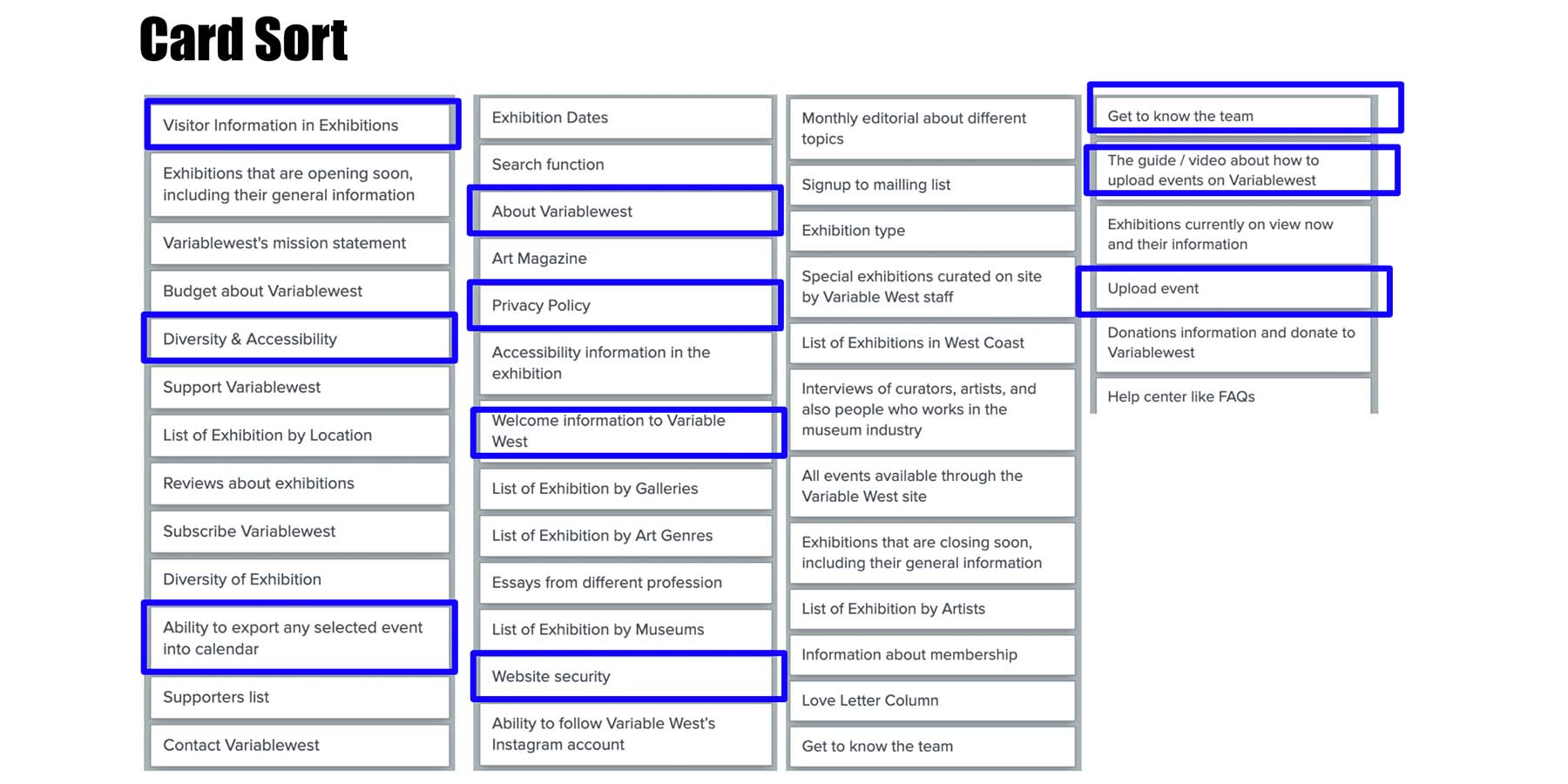
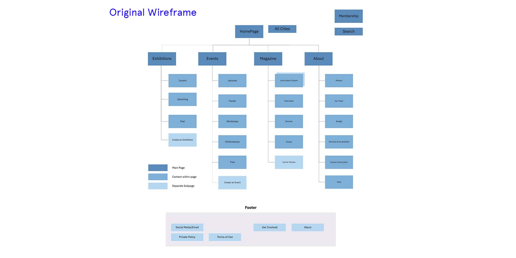
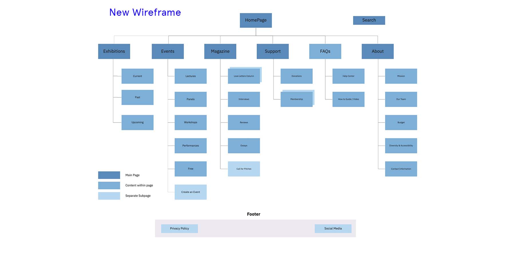
After collecting and analyzing the data, we made structural adjustments
Enhance User Experience with Navigation Bar Improvements:
1. Distinguish Exhibitions from Events for More Precise Filtering
2. Introduce FAQs Section for Easy Customer Support Access
3. Optimize Button Labels Across Site Pages to Align with User Expectations and Streamline Navigation Flow.
PHASE III
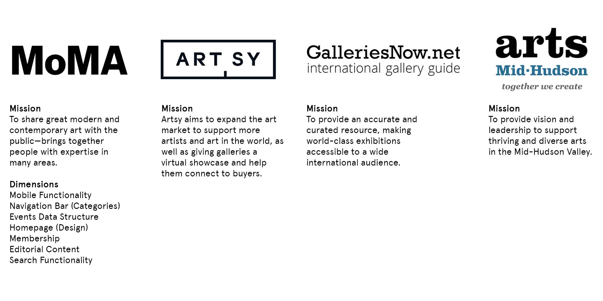
Analyzing Competitors
Analyzing Competitors
In the process of analyzing our competitors, we've identified several key areas for improvement in our user experience and website navigation. To enhance our offering, we aim to separate exhibitions from events in our navigation bar for a more refined filtering experience. Additionally, we plan to introduce a dedicated FAQs section to provide users with quick and convenient access to customer support. Lastly, we'll update button language across our site pages to better align with user expectations, ensuring a smoother navigation flow. These strategic insights will enable us to stay competitive and continually enhance our users' online journey.
